
AMBUCS is a patriotic company; its official colors are red and blue. For some reason it had chosen an eye-bleeding orange-y red (I believe in earlier days it was a common red color to print).
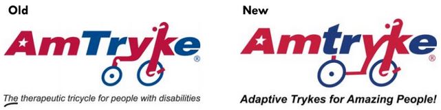
Old Branding
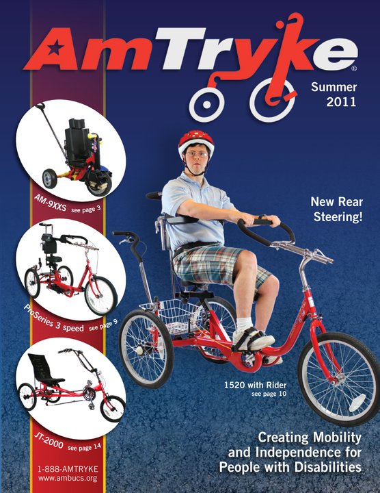
2011 catalogue, two years before I started. Leadership did not like blue as primary. 
Original Branding when I came on-board 
I quickly switched to a cleaner look and true American flag red.
2015-2016 Rebranding
I switched to PMS 193C, the actual red of the American flag. Previous directors had relied on the orange-y red, black and gray for an overall dark effect. But the core of our business is giving trykes to kids.
I worked with a designer on a new Amtryke Therapeutic Tricycle catalogue with light blue and aqua as background colors and American red as the POP color. The light colors pretty much disappear and showcase the red (most importantly the red bikes themselves) and hints of America blue.
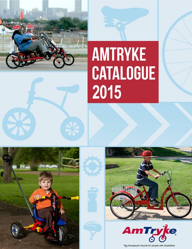
2015 Catalogue 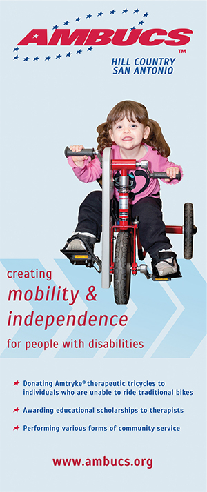
Chapter Banner Redesign 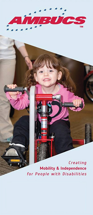
General Brochure Cover
Now every piece of collateral, from brochures to banners to business cards, have been updated to this scheme.
2018 Rebranding
In 2018, the board approved new taglines for both AMBUCS and Amtryke and a redesign of the Amtryke logo. Both now also use PMS 282C – a darker, true American flag blue color. The board decided to remove the word “disabilities” from our tagline, mission statement and all language not clinical in nature. More about that in this portfolio.
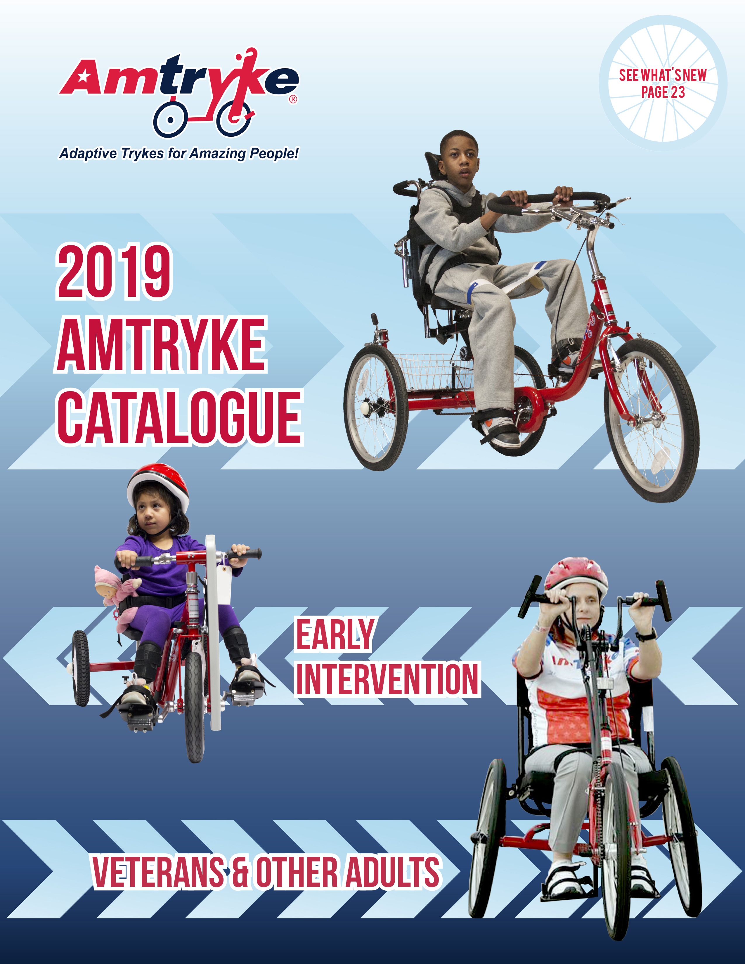
2019 Amtryke Catalogue 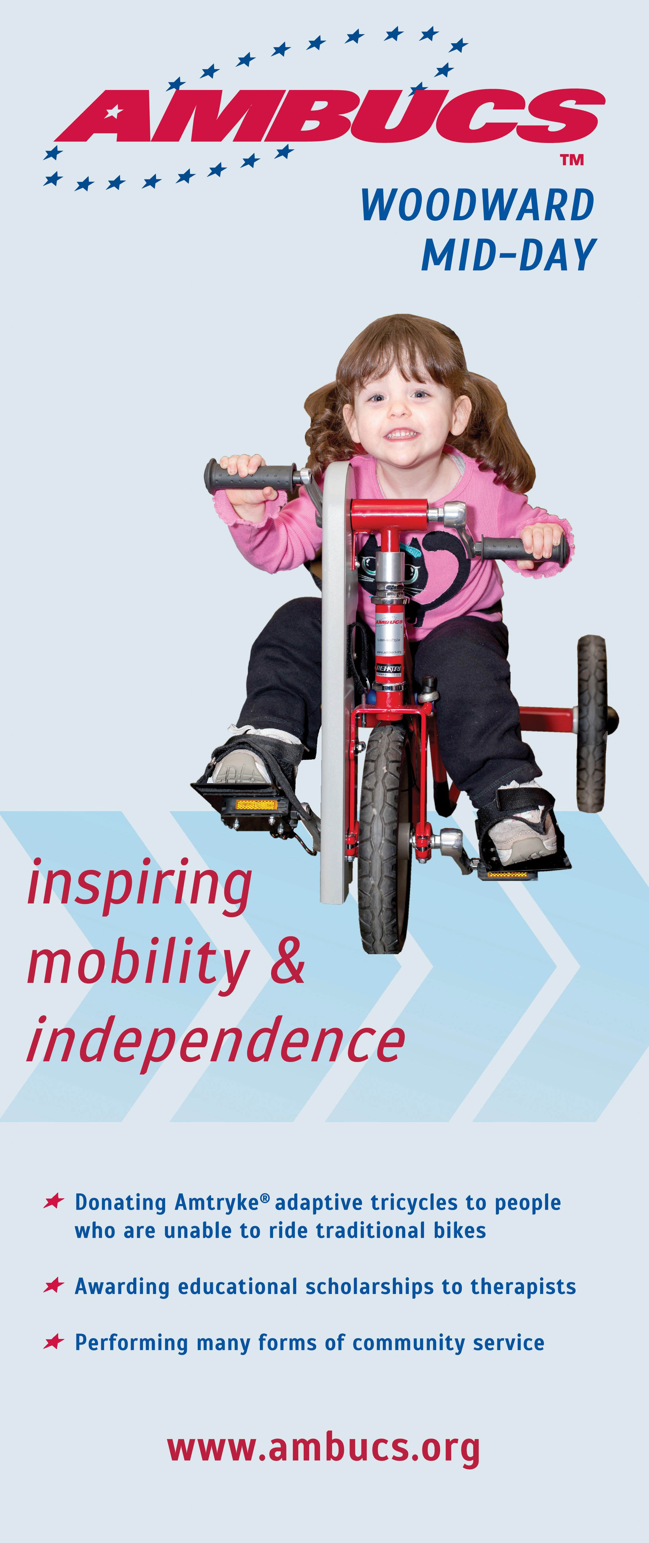
2019 Chapter Banner 
2019 Brochure Cover
It was past time for a Amtryke logo redesign. The tryke in the old logo reflected a very old frame design, long discontinued. (See below: notice the size of the wheels and the height of the frame where you would step over.) The company started using a lowercase ‘t’ in Amtryke in all text in 2015.
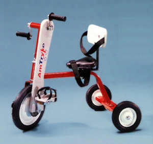
A Christmas Ornament version of the old frame design 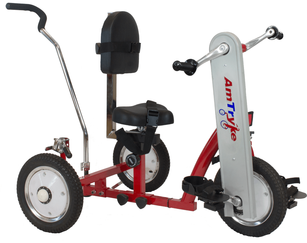
Current frame design
A few more…
Old Dark Banners 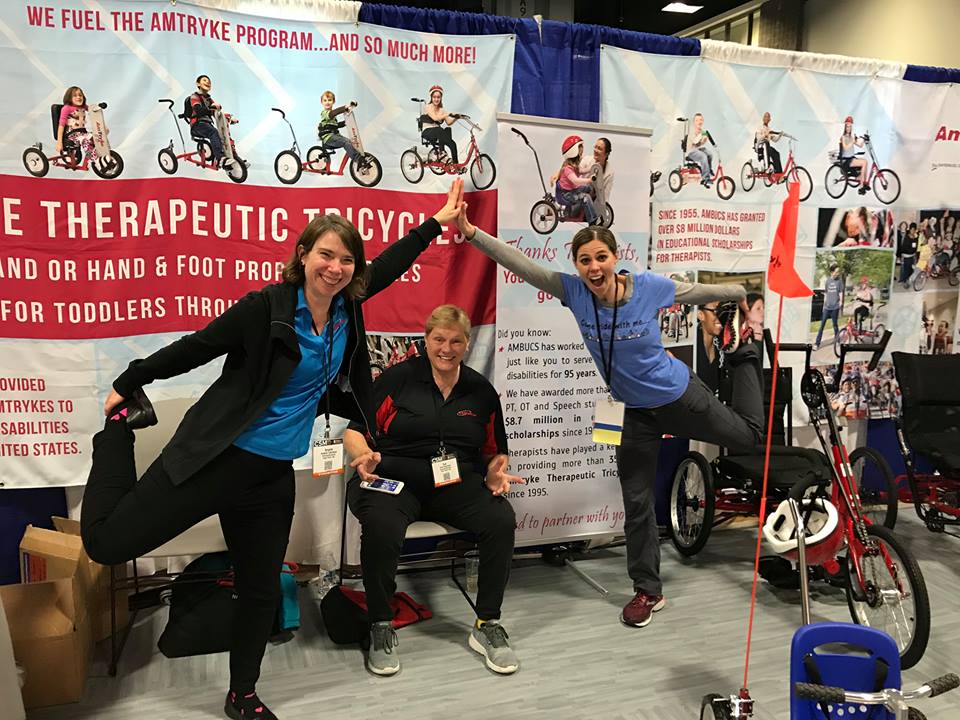
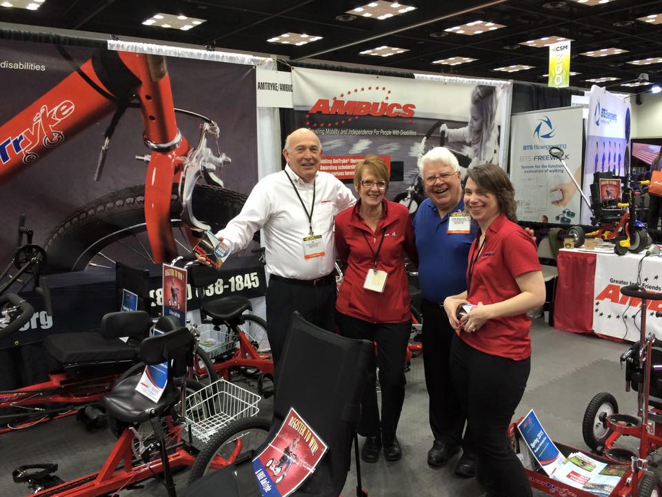
New Banners (don’t worry, this was before the floor opened)
Standing next to legends, folks. In the fist image (one of my very first trade shows) I’m standing next to Fred Sammons. Fred is the most famous Occupational Therapist in the world, founder of Sammons Preston and an incredibly kind man. In the second image, Ashley Schilling and I are making a bridge over the woman who inspired the Amtryke – Sue Haywood, Physical Therapist. As you know if you have ever worked a trade show, you get a little punchy by the morning of the third day. 🙂
